Theming
VisuAuth ships four layers of customization, ranked from simplest to most powerful. Each builds on the one before — pick the lowest layer that meets your need. They compose: a CSS token override (layer 1) still applies under a per-tenant theme (layer 4).
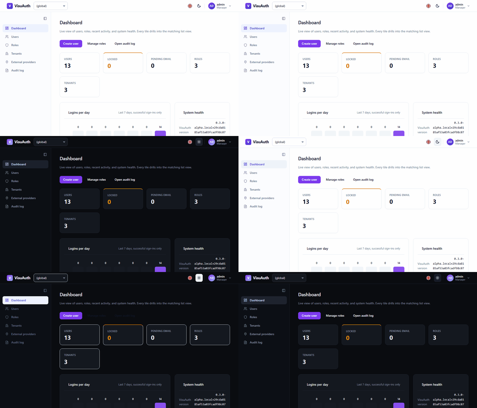
A built-in light / dark theme works out of the box: dark mode applies
automatically via @media (prefers-color-scheme: dark), and the header toggle
switches it manually by setting data-theme="dark" on the root.
Layer 1 — CSS custom properties
The simplest customization. VisuAuth's default theme lives in
wwwroot/visuauth.css (served at /_content/VisuAuth.AdminUi/visuauth.css) and
is driven entirely by CSS custom properties. Override any of them in your own
stylesheet, loaded after VisuAuth's, and the cascade does the rest — no fork,
no rebuild.
/* your-site.css, loaded after visuauth.css */
:root {
  --visuauth-primary: #7c3aed;     /* brand fill / focus */
  --visuauth-primary-fg: #ffffff;  /* text on the brand fill */
  --visuauth-radius: 0.75rem;      /* corner radius */
}
The main tokens (a default shown in parentheses where it's a single value; see
visuauth.css for the full set, including the light/dark values):
| Token | Role |
|---|---|
--visuauth-primary (#6366f1) |
Brand fill, focus ring |
--visuauth-primary-hover / -active |
Hover / pressed brand states |
--visuauth-primary-fg (#ffffff) |
Text on the brand fill |
--visuauth-primary-soft / -soft-fg |
Tinted surface + its text |
--visuauth-bg (#ffffff) |
Page / card background |
--visuauth-fg |
Base text color |
--visuauth-muted |
Secondary text |
--visuauth-border |
Borders |
--visuauth-surface |
Table headers, sidebar, hover rows |
--visuauth-danger / --visuauth-success |
Status colors |
--visuauth-radius |
Corner radius |
--visuauth-font |
Font stack |
To override dark mode specifically, scope your overrides to
:root[data-theme="dark"](and/or theprefers-color-scheme: darkmedia query) so they only apply in dark mode.
Layer 2 — programmatic config (VisuAuthTheme)
When the brand comes from configuration rather than a stylesheet, set the tokens
in code. VisuAuth renders a :root { … } block right after the default
stylesheet (via the <va-theme-style /> tag helper), so your values win without
touching CSS.
services.AddVisuAuth<ApplicationUser>();
services.Configure<VisuAuthTheme>(theme =>
{
    theme.Primary   = "#7c3aed";
    theme.PrimaryFg = "#ffffff";
    theme.Radius    = "0.75rem";
});
Every VisuAuthTheme property is nullable and maps to one token — Primary,
PrimaryFg, Bg, Fg, Muted, Border, Surface, Danger, Success,
Radius, Font. Anything left null or blank falls through to the layer-1
default in visuauth.css.
Layer 3 — Razor view overrides
For structural changes beyond colors, replace VisuAuth's views with your own.
Drop a same-named .cshtml into the override folder (default /Views/VisuAuth,
configurable) and VisuAuth falls back to its built-in copy when yours is absent.
services.Configure<VisuAuthViewOverrideOptions>(o =>
{
    o.Root = "/Areas/MyBrand/Views";   // anywhere under the host project
});
Two cooperating mechanisms make this work, with no extra registration for the consumer page:
- A view-location expander prepends
{Root}/{name}.cshtmland{Root}/Shared/{name}.cshtmlto Razor's search list, so partials and layouts (_Layout,_EndUserLayout) resolve your copy first. - A page-demotion convention lowers the route priority of every VisuAuth
Razor Page, so a consumer Razor Page in the host app declaring the same
@page "/visuauth/login"route wins via the lower-order-wins rule.
Layer 4 — per-tenant overrides
With multi-tenancy on, vary both theme and
templates per tenant at request time. Implement either or both resolver
contracts; the default registrations are no-ops that return null, so consumers
who never opt in keep the fast path.
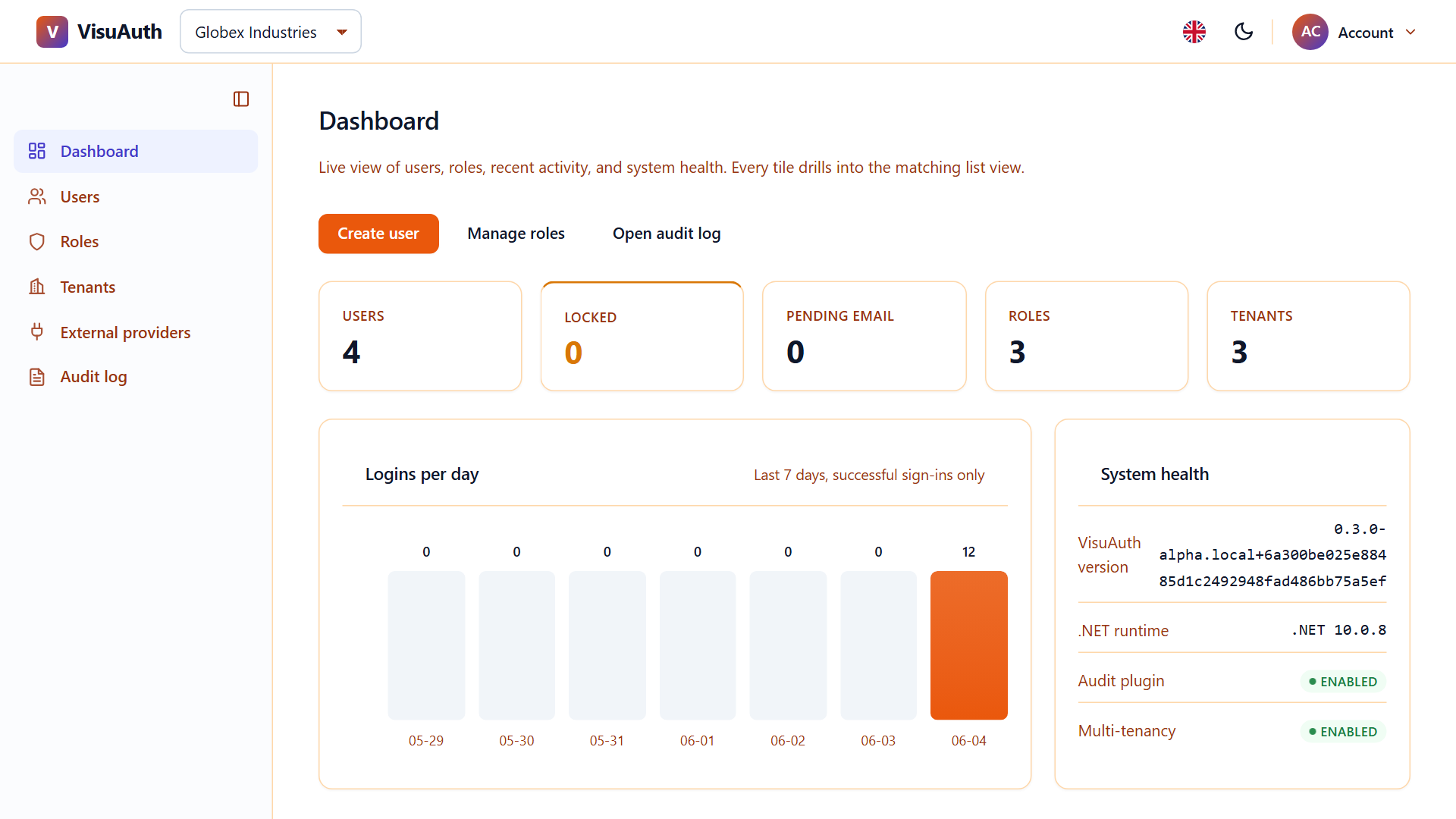
Per-tenant theme — ITenantThemeResolver returns a VisuAuthTheme? keyed
off the current tenant. VisuAuth overlays it on the global layer-2 theme via
VisuAuthThemeMerger.Merge: a non-blank tenant property wins, the global theme
fills the rest, and anything still null falls through to the CSS default. So a
resolver can change just Primary per tenant and inherit every shared neutral.
services.AddSingleton<ITenantThemeResolver, MyTenantThemeResolver>();

public sealed class MyTenantThemeResolver : ITenantThemeResolver
{
    public Task<VisuAuthTheme?> ResolveAsync(string? tenantId, CancellationToken ct = default)
        => Task.FromResult(tenantId switch
        {
            "acme"   => new VisuAuthTheme { Primary = "#dc2626" },
            "globex" => new VisuAuthTheme { Primary = "#0ea5e9" },
            _        => null,   // fall back to the global theme
        });
}
Per-tenant views — ITenantViewOverrideResolver.ResolveOverrideRoot(tenantId)
returns a per-tenant folder (e.g. /Views/VisuAuth/Tenants/acme) that's probed
before the global layer-3 root and the package defaults, so markup can vary
per tenant.
Use
AddSingletonfor a stateless lookup, orAddScopedwhen the resolver needs per-request services. The view resolver is synchronous because Razor's view-location pipeline is sync — cache any database lookups behind it, as the expander asks on every render.Per-tenant whole-page overrides (a different consumer Razor Page per tenant at the same route) need a custom endpoint-selector policy and are out of scope — layer 4 covers per-tenant themes and partial/layout templates.